

Data visualization is the method to understand data better and easily. That's why there are tons of such tools to change textual data into attractive charts and graphs.
Chartify is one of those powerful data visualization tools that can turn normal data into easily understandable graphical representations.
In this article, we'll discuss, What is Chartify? What are the best Chartify alternatives for data visualization? We'll also cover each of their features and plans, if any.
So, let's get started.
What is Chartify?
Chartify is an advanced data visualization, charts & graph maker. It features Python libraries for accurately designing graphs. It offers a high-level interface for creating simple yet useful visuals from your input data. It is built on Python's data manipulation library (Pandas), and the visualization library (Matplotlib).
 |
| Image Source: Chartify |
Key Features
- Simplified API
- Support for various chart types
- Data transformation capabilities
- Interactive visualizations
- Automatic labeling and formatting
- Customization options
- Integration with Pandas and Matplotlib
- Python-based library
- Quick and easy chart creation
- Suitable for data analysts and scientists
Best Chartify Alternatives
Chartify is a powerful data visualization tool. It can be used for creating charts & graphs with the help of AI. Further, we'll talk about 8 best chartify alternatives that can outrank Chartify in data visualization. So, without wasting any time further, let's get started.
1. SlidesAI
Slides AI is one of the most powerful data visualization tools that creates interactive presentations with only some text. You just need to input some text and it will automatically create text-focused slides. It also works with Google Slides to provide customizable themes, multi-language support, and create professional & engaging slides without any prior experience. SlidesAI not only follows the text-to-presentation method but also allows the topic-to-presentation feature. Slides AI also has a huge library of 1.5 Million stock images. After creating amazing presentations, you can export slides as videos.
 |
| Image Source: Slides AI |
Key Features:
- Text to Presentation
- Presentation Templates
- Customizable Design Options
- Magic Write
- 100+ Language Support
- Google Slides Integration
- Video Export
- Screen Recording
- Virtual Camera
- Slide Animation
- Presentation Analytics
Pricing / Plans

- Free Plan: Limited features and presentations per month.
- Pro Plan: More features, presentations, and AI credits.
- Premium Plan: Unlimited presentations, high character input limit, and additional features like PDF & Markdown export.
2. QuickChart
QuickChart is another great alternative to Chartify. Instant generative chart images can be created using QuickChart. It uses the open-source library Chart.js to render charts. It creates bar charts, line charts, area charts, bubble, scatter, multiple doughnut chart formats, labeled pie, polar area charts, radar, QR codes, speedometer charts, progress bars, and many more. It is best suited for those who have some experience with charts & graphs. QuickCharts is also a great option for those users who want to embed charts in websites and other applications.
 |
| Image Source: QuickCharts |
Key Features:
- Easy to use
- Chart Maker
- API Support
- Wide variety of charts
- Customization Options
- Embedding Charts
Pricing / Plans

- Free Plan ($0/month)
- Professional Plan ($40/month)
- Enterprise Plan (Contact Quickchart for more information)
3. Flourish
Flourish is a beautiful data visualization tool that helps users create click-worthy and animated data charts, graphs, and stories. To use Flourish, you don't need any prior designing skills. You also don't need any coding experience to work on Flourish. This data visualization tool is highly customizable because you can use custom themes, and edit colors, fonts, etc. for your charts. From bar charts to heatmaps, Flourish has multiple chart formats, such as bar charts, pie charts, heatmaps, highlighted bars, column chart races, sunbursts, treemaps, packed circles, and more. You don't just create charts, you also create animated slideshows and presentations with your data. Flourish data visualization tool is available for smartphones, tablets, and obviously computers as well. If you have been working on Excel or any data spreadsheets, you can import spreadsheet data to create charts, and graphs effortlessly.
 |
| Image Source: Flourish |
Key Features:
- Ease of Use
- Mobile-friendly
- Pre-Built Templates
- A Wide Variety of Visualizations
- Data Import
- API Access
- Data Privacy and Security
Pricing / Plan

- Free plan
- Pro plan
- Enterprise plan
4. Data Wrapper
Data Wrapper is another powerful option for graphical data representation. It is a web-based data visualization tool, that allows users to create attractive and responsive charts, maps, and tables. It is a no-code data visualization tool, which means you don't need to worry about coding or designing skills to create data charts & graphs for your business. Data Wrapper is highly used by some popular organizations, like the UN, the New York Times, SPIEGEL, and more. Data Wrapper allows users to export responsive charts in PNG, SVF, and PDF formats for desktop devices, tablets, or smartphones. It also offers collaboration integrations with shared folders, Slack, and Teams. Data Wrapper creates beautiful and high-quality data graphics, which can be exported with print-ready PDFs.
 |
| Image Source: Data Wrapper |
Key Features:
- User-Friendly
- Beautiful Design
- Interactive Features
- Embedding
- Collaboration
- Accessibility
Pricing / Plans

- Free Plan ($0 per month)
- Custom Plan (Starting at $38.42 per month (billed annually))
- Enterprise Plan (Custom quote based on needs)
5. Visme
Visme is a popular web-based design and visualization software. It offers different useful tools for presentations, reports, and infographics. One of those features, Visme offers an easy-to-use chart & graph maker. It helps designers create amazing visuals, charts & graphs that don't require any designing or coding skills.
Key Features
- Visual communication platform
- Chart and graph maker
- Presentation creation tools
- Infographic design capabilities
- Report and document creation
- Pre-designed templates and themes
- Customizable designs and layouts
- Data import and integration options
- Interactive and animated visualizations
- Collaboration and team collaboration features
Pricing / Plans:

- Personal ($15 per month)
- Business ($29 per month)
- Enterprise (Custom pricing, contact Visme for quoting)
6. Taskade
Although Taskade is popular for its task & project management tools. It also offers an AI Graph Generator, which is capable of creating wonderful data visuals. The most common use of Taskade AI graph generator is creating charts & graphs for comparing various entities such as Bar Charts for comparing a company's growth or comparing inflation rates over the years.
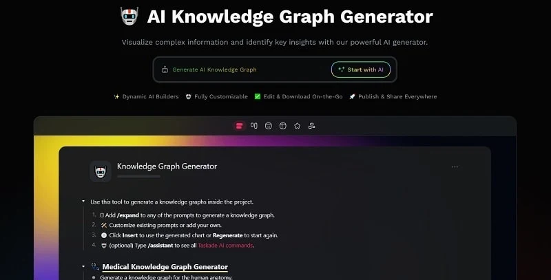 |
| Image Source: Taskade |
Key Features
- Interactive chart and graph creation
- Wide range of chart types
- Data input and import options
- Customizable chart styles and colors
- Labels and legends customization
- Real-time data updates
- Collaboration and sharing capabilities
- Integration with other Taskade features
- User-friendly interface
- Data visualization options
Pricing / Plans
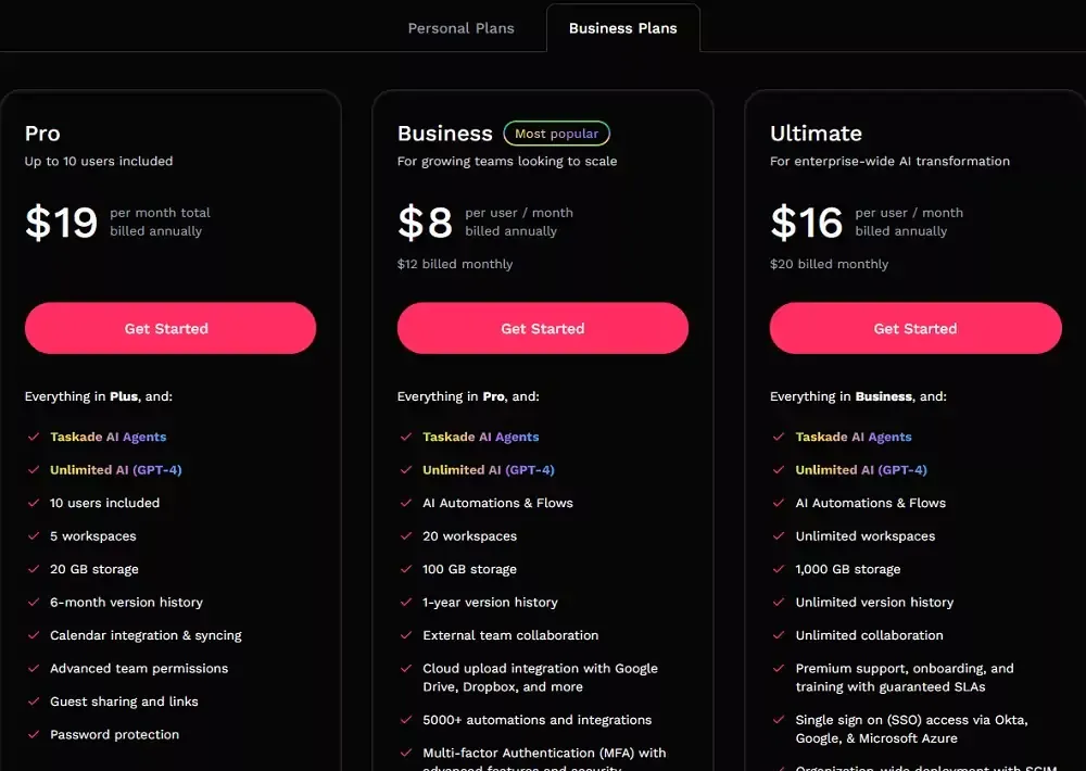
- Free
- Limited ($5 per user per month)
- Unlimited ($7 per user per month)
- Enterprise (Custom pricing)
7. Chart Blocks
Chart Blocks is an online, cloud-based data visualization software with capabilities to create charts & graphs with the help of AI. It offers a drag-and-drop toolset for creating interactive graphics. Unlike some other charts & graph software, Chart Blocks offers pre-installed templates for different charts and graphs.
 |
| Image Source: ChartBlocks |
Key Features:
- Wide range of chart types
- Customizable styles and colors
- Real-time data updates
- Data import/export options
- Interactive charts with tooltips and hover effects
- Integration with popular data sources
- Responsive design for various devices
- Collaboration and sharing features
- Embed charts into websites or applications
- Data filtering and sorting options
- Customizable data labels and annotations
- Multiple data series support
- Trend lines and regression analysis
- Export charts to different file formats
- Print and PDF export options
- Time series analysis features
- 3D visualization capabilities
- Statistical analysis tools
- Automated chart generation
- API access for advanced users
- Support for custom code and scripting
- Data input validation
- Real-time data streaming and updates
- Customizable chart animations and transitions
- Dashboard creation and management features
Pricing / Plans
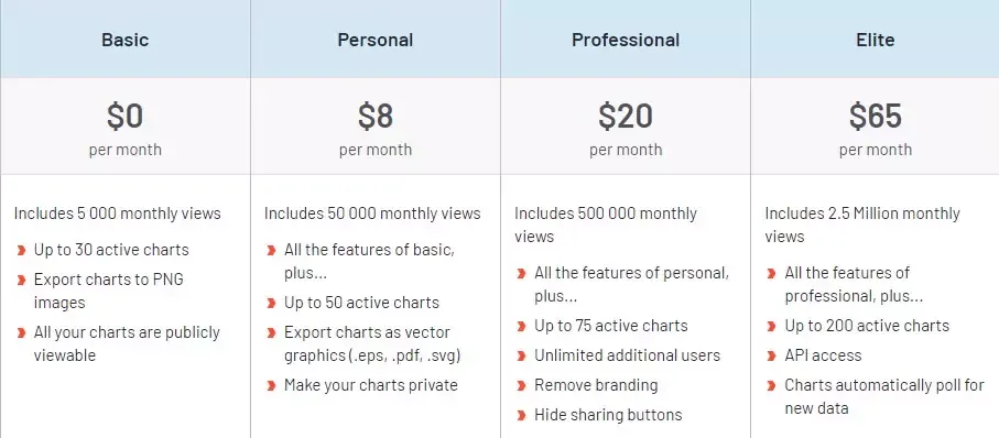
- Free
- Basic ($9 per month)
- Pro ($29 per month)
8. Graphy.App
Graphy is a data visualizing tool that features a clean platform for creating attractive graphs and also features a dashboard. You, as a user, can collect data from different sources, create attractive infographics including charts, graphs, and data reports, and then share them. It offers several beautiful templates, power-ups, and annotations that help you create charts that may increase your chance of rising in your company.
 |
| Image Source: Graphy |
Key Features:
- Simple data import
- Variety of chart types
- Customization options
- Collaboration
- Embed & Share
- Offline access
- Instant Visualizations
Pricing / Plans
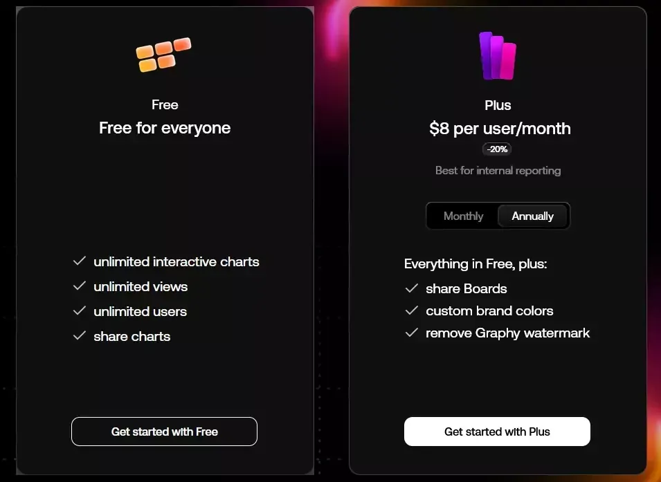
- Free
- Pro ($25 per month)
Conclusion: Chartify Alternatives
Chartify is a powerful data visualization software. But there are several other types of data visualization tools, some are best for beginners, and some are highly advanced and cover more features. These days, we also get AI-powered data visualization tools, which need only topics for creating charts & graphs. Such software automatically collects data and brings together everything in the form of charts and graphs.
Choosing the best data visualization tool is on you. You must know what your requirements are. If you don't need advanced features and just getting started, you may use the free versions of these Chartify alternatives. You can upgrade to pro plans anytime when you need it. So, we suggest you try the free versions first and get handy with the software, then go for the pro plan.
So, that's it for the article. If you have anything to ask, go on, and let's talk in the comment section.